Showing posts with label Invitations. Show all posts

Wednesday, July 14, 2010

Time To Reveal The Invitations!

Since we are in the process of giving out the invitations and those who are likely to read this blog have already received theirs, I think it's time to share them with you lovely gals. 

As you may recall, Mr. Milk designed our invites and we had them professionally printed by a friendor. They arrived in a box looking like this


Pretty overwhelming to look at initially!

A close-up of our RSVP card

Accommodations insert

And the thing Mr. Milk is most proud of (I think), the directions insert with his DIY map.

The belly-band (which I am most proud of)!

While this isn't the best picture, you get to see how shimmery the paper and lettering is.

The whole thing put together. Due to the picture quality, you can't see the glittery paper unfortunately, or how it makes the ink shimmer. I love how the D, A, & R align. 

And all wrapped up with the belly-band. We ordered regular pocketfolds and asked our printer to cut the flap of the envelope to move the point from the center to the right-hand side. 

A better, detailed shot.


And here you can see what the invitation says (click to enlarge). 

There you have it ladies, our invitations in full! So far we have gotten great feedback for them, which makes Mr. Milk very happy. A few important people didn't have anything in particular to say, but we've decided to just ignore them :) All in all I am super happy with how they turned out.

Were you happy with your invitations? Did you DIY, take the pro route, or a combo?

Tuesday, July 13, 2010

One Reason We Moved Back...

Was to be closer to family...


And here we are goofing around while assembling wedding invitations with my mom and sister :)

Friday, May 7, 2010

Fridays with Mr. Milk - Lending A Helping Hand

So Chocolate Lover has been slaving away recently, in order to get all the invites prepared. As one would expect, the excitement of it all ended shortly after assembling the first few pocket folds. With a few hundred to go, the stick, press, fold, insert and repeat routine, got to be quite the mundane task. So I was called in to help, and if it took CL 'x' amount of time to be bored by the task, it took me 'x/10'.

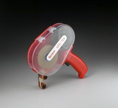
I always like to come up with quicker and better ways of doing things, so instead of focussing on the task at hand, I spent more time staring at the double-sided sticky tape in order to figure out a contraption that would make it work faster. I think I frustrated Chocolate Lover a little, but I eventually called it quits and begun researching internet videos for ideas. Low and behold, the Scotch ATG 714 applicator!


The economics may appear a little frightening at first, with the device costing over $60, but they make a lot more sense when you see how fast one can apply the glue and how cheap the replacement tape is ($4 for 60 yards). So I eBayed the little miracle device and now I'm patiently waiting for it to arrive in the mail so that I can continue to be of service to the boss in charge of the invite assembly.

Hang in there and a review is coming up shortly.

Until next Friday, this is Mr. Milk signing off.

Tuesday, May 4, 2010

Invitation Teaser

Hardly anyone who is invited to the wedding reads this blog. BUT, if you are one of those few, this is NOT a post you can read! So hurry along and do something else. Thanks!

Wednesday, April 21, 2010

Envelopes

Not sure if you remember, but my first Etsy purchase was a stamp that matched the font that we had chosen to use for our invitations and monogram. While our invitations have arrived, they need assembling and I will post about those once some have been mailed out - we are sending some of them super early for our international guests.

But back to the stamp. I decided I was going to use it to adorn our envelopes. I still haven't decided what I am doing to address them, but likely just use labels. So to make them prettier, I've been spending my spare time doing this...

We found some turquoise ink at Michael's and a stamp on clearance, which we proceeded to rip off the wooden block and super-glue our own onto it! There are a ridiculous amount of envelopes to stamp, but what the heck. They'll look cute.


This is what they look like. I am stamping the upper left hand corner of the envelope on some, and the center of the flap on others. Keep in mind that we will have the wedding on September 25th and a reception that following Wednesday evening (29th) for our parents friends and colleagues, so we have two different invitations. 

Funny note: Half way through stamping I realized that I am stamping the invitation envelopes for the 29th with a stamp that says 25.09.2010! Oh well! What to do...

Did you purchase any stamps? What are you using them for?

Thursday, March 25, 2010

Introducing Our Monogram

We are finally done with designing our invitations! We've spent a lot of time looking at invitations and stationary online and even went as far as to inquire about designing invitations with a professional. But we finally settled on doing them ourselves since Mr. Milk is pretty talented in this area. 

Mr. Milk is definitely the creative one in this duo. He has a good eye and does a lot of similar things for his work. He also has some connections with a professional printer, which means we can get our paper products printed for much cheaper. So after we got over the technical issues we were having, we got into creative mode, and started with the monogram. We chose the font we liked and off we went.

Here is what we first came up with. 


We both liked this one and it was the contender for a while until we worked on it a little more. Not sure how the color will show up on your screen but they are supposed to be pool/aqua (border, names, date) and sand (initials). Between the different computers we've seen this on we get light blue, very bright blue, and aqua. But you get the idea I guess. The monogram will be backed onto metallic aqua cardstock, hence the border.

We were happy with the color scheme but thought about making it a little more modern. So here is what we finally decided on:


What do you think? How are you doing with invitation/stationary design and/or purchase?

P.S. 6 MONTHS TO GO!

Friday, December 4, 2009

Friday's with Mr. Milk - How To Make Your Own Direction/Map Card


It feels like we are getting more into the detailed work with the wedding planning. There's so much to do and so much to plan for, so it feels good to actually get some tasks completed. Chocolate Lover gave me one task that I could have some fun with: designing our directions card for our wedding invitations.

If you don't know the difference between vector and bitmap files, this is a good reason to find out. Here's my explanation: If you take a picture (in the form of .jpg, .gif, .png, etc.) and increase it's size, you'll notice that the quality of the picture gets worse. That's because if the picture is made up of 100 pixels, by increasing the size of the picture (which is saved in a bitmap form) you are effectively increasing the size of each pixel, hence making the tiny little buggers more visible to the eye. The result is a more grainy look which is characteristic of low quality pictures. 

When you buy a digital camera and the salesperson says this one is 2 megapixels or 6 or whatever, that's what they are referring to: The number of pixels that will be captured by the camera's digital processor and hence the number of pixels that will be printed on the paper. The more pixels you have the better it is for printing larger size photographs. This doesn't mean that a 10MP camera will print a better picture than a 2MP if they are both printing on 4x6 paper. You can still only see 72 dots per inch (or dpi) on your screen, and when you print you can still only fit so many pixels in a given area. So as a side note to this week's post, if you are thinking of buying a digital camera and if you are not planning on printing on anything larger than 8X10, a 3.2 MP camera will do just fine.

Now back to the topic. Unlike bitmap, a vector graphic is one that uses mathematics in order to calculate its shape. For instance if I am using software such as Adobe Illustrator to draw a line which may contain 100 pixels, and then I extend the line by dragging one of its corners, then I am sending a signal to the computer that I want the line to increase in size and the computer then adds pixels to fill the space. So if I double the size of the line, it should now have 200 pixels as opposed to 100 pixels that are twice the size. So vector files = quality is untouched and bitmap files = don't mess with the size! 

To draw our directions card for our wedding venue, I wanted to trace a Google Map image in order to keep the proportions correct. I started by placing the image below into Keynote (Apple's equivalent to Power Point but 1,000,000 times better - no bias here).


You can do this by using a screen capture tool, pressing the "Print Screen"  button on your PC, or Shift+Command+4 on a Mac and selecting the area you want to capture.

I then traced the route using a line drawing tool. You will find this under "Shapes" in Keynote. What this allows you to do is to click along the line of the road while a line joins the point you are on with the previous one. The more clicks the smoother the line. This being a graphic tool, the line is a vector file so there's no degradation to the quality of the image if it is resized later. 

Below is a picture of the tracing process. Don't worry about making mistakes. You can always click on a a single point along the line and either move it or delete it.


Once I had the lines traced I played with the sizing of the stroke to emphasize the highway. To do that, you first select the line you want and then from the Graphics Inspector you change the stroke of the line. Although in the picture below I used two thicker lines to emphasize the highway, you will see later on that I then changed to a single line of stroke thickness 23px for the highway and 6px for the side roads. 


I then added some directional arrows and text, again from the "Shapes" menu, and removed the now traced satellite image by moving it out of the way. A couple of more details included a blow-up of the traffic circle close to the hotel, and some labels to indicate the road names, etc. 


Then I selected each item and from the Graphic Inspector I changed the colour as shown below. To make the filled area representing the Mediterranean Sea, I used the line art tool again but this time I added three more points to connect the 90 degree triangle that takes up the bottom left corner of the map. You'll see that by connecting the first point of your line to the last one, you end up with an area filled shape. 


A quick copy and paste into Adobe Illustrator and my job is done. The beauty of using Keynote was its simplicity. Once in Illustrator I could resize up or down with no loss in quality. 

I hope you've found this useful. What programs do you use for your design work? 

Until next Friday, this is Mr. Milk signing off.

Monday, November 16, 2009

Look What Came In The Mail!

I waited all day for UPS to ring the door bell. And finally, at around 3pm they did!


What was in it you ask? Lets see...


Just teasing!


Yup! It's our envelopes and metallic pearl pocket-folds from Cards and Pockets!


Can't wait to get these going!

Tuesday, November 10, 2009

One Step Closer

I am excited to be writing this post! As some of you already know Mr. Milk and I have recently been working on our invitations. We've been looking at colors, fonts, wording, paper, envelopes, monograms, ribbons, you name it we've looked into it! You can read about what Mr. Milk was up to a few weeks ago

So without further ado, here it is:


Hahahahaha. Just kidding! Mr. Milk found this while browsing for invitation wording and we thought it was HILARIOUS! Not sure where he found it so no source (let me know if you know).

So back to being serious. We have debated over what items to purchase. Mr. Milk has some good connections in the printing business due to his work, and we are fortunate to be able to use these connections for our invitations. We have decided that we want pocket-fold invitations. We can get the paper for the invitation, inserts, and mats from the printer, so all we needed was the pocket-folds and envelopes.

So over the weekend we made the purchase. I found a wonderful site called Cards and Pockets a while back and bookmarked them in my favorites! I encourage you to check them out as they are also offering 25% off their entire site until November 15th! I even ordered a sample set with the colors I wanted for only $10 with free shipping. I highly recommend doing this. We were able to play around with these and get an idea of the inserts we wanted, the sizes and so on. 


I ordered them in pearl metallic cause I just love the metallic papers. Our invitation mats will be a tiffany blue. Neither of us was keen on the European Envelope, so even though the other style only comes in cream and white, we opted for those. I can't wait to get them! I know its only the outside but it means we are closer to making them happen! Stay tuned for more to come on the invitations!

How are you invites/stationary coming along?

Wednesday, October 7, 2009

Need Your Help!

Mr. Milk and I spent a lot of the weekend talking about wedding invitations. We've decided that we want pocket-fold invitations in pearl and aqua metallic paper. We are narrowing down our colors, but are getting stuck on the color of the ink. I initially liked a sand/goldish color but then Mr. Milk suggested silver. Now I'm in a whirlwind of confusion as I can't decide. I like both! 

So here are a couple of pics of a quick sample I literally threw together just to get an idea/comparison. I was thinking about bridesmaids too (obviously) hense the content!


In all honesty I have never been a gold-type-of-person, but for some reason I am attracted to it now! Go figure. I thought I would throw my dilemma out to you gals for some feedback. What do you think? Which do you prefer? Any other suggestions? Help!