Posts
Posts


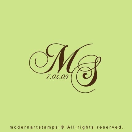
Mr. Milk is definitely the creative one in this duo. He has a good eye and does a lot of similar things for his work. He also has some connections with a professional printer, which means we can get our paper products printed for much cheaper. So after we got over the technical issues we were having, we got into creative mode, and started with the monogram. We chose the font we liked and off we went.
Here is what we first came up with.

We were happy with the color scheme but thought about making it a little more modern. So here is what we finally decided on:

What do you think? How are you doing with invitation/stationary design and/or purchase?
P.S. 6 MONTHS TO GO!